Role: Senior Product Designer
Timeline: 6 months (Launched January 2026)
Team: Product Manager, Analyst, Engineers, Legal, Business, Marketing
Platform: Responsive web (desktop & mobile)
Final work: ERGO Life Insurance Online
The Challenge
At ERGO, life insurance had always been sold through agents and physical offices. Customers had no way to purchase a policy online. Our goal was to enable a fully digital life insurance purchase experience — something that had never been done before within the company. However, designing this flow meant navigating several difficult realities:
• Life insurance is highly regulated
• Medical disclosures are legally required
• The topic itself is emotionally sensitive
• The process is traditionally guided by human agents
Creating a digital experience that felt simple, trustworthy, and compliant was the core challenge.
Background
A previous attempt at an online flow already existed, but the concept was different. The “life puzzle product” concept allowed users to build their own insurance package by selecting risks and coverage amounts individually. In theory, this offered flexibility, but in practice, it created major usability issues:
• The journey became very long and complex
• Users had to make technical insurance decisions themselves
• The health questionnaire alone took over 10 steps
• The language was dense and heavy because of the legal terms
We tested the idea and got early feedback. Instead of empowering users, the experience overwhelmed them. So we defined the challenge:
How might we design a digital life insurance experience that replaces an agent while keeping the process simple and transparent?
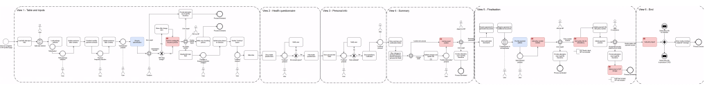
By mapping the full journey and analysing the interaction points, I identified several friction areas, and by communicating these findings to stakeholders, I helped shift the direction of the product from a “build-your-own policy” model to a simpler, guided package approach.
Understanding the System First
Before designing screens for the new concept, we needed to understand how the updated insurance system actually worked behind the scenes. Together with our analyst, I mapped the entire system logic, including:
• user journey
• eligibility rules
• risk calculations
• backend decision points
This system map became a shared artifact across teams, helping all stakeholders align on how the digital process should work. It was also helpful to use as a reference point during the prototyping phase. Without understanding the system complexity, designing the experience would have been impossible.
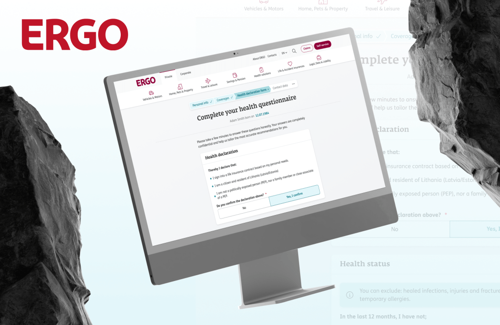
The Health Questionnaire
Previously it spanned 10+ separate screens, used legal and medical language and asked users emotionally difficult questions about illness and risk.
Answering these questions was already uncomfortable. The previous concept made the experience feel long, intimidating, and clinical. So, I proposed rethinking the questionnaire completely. Instead of optimizing the existing flow, I initiated conversations with legal, marketing, and business stakeholders to explore whether the process could be simplified. Our goal was to reduce the questionnaire from a multi-step process to a much lighter version without violating legal requirements. Through several discussions and iterations, it was discovered that the required information could actually be restructured and simplified.
The Solution
We redesigned the questionnaire to collect all required information within a single page. The final structure grouped questions into three clear sections, making the experience easier to scan and complete. The goal was not just efficiency, but also reducing the emotional burden of answering sensitive questions. Key improvements included:
• replacing open text fields with selection buttons
• grouping related questions logically
• simplifying legal language together with content writers
• introducing clear, human explanations
Designing the Purchase Flow
A key issue with the previous attempt at an online flow was how users had to build their own insurance package from scratch. They were expected to select risks and coverage amounts one by one, effectively assembling their policy like a puzzle. While this offered flexibility, it created a heavy decision-making burden. Most users are not insurance experts, and the number of choices made the process feel complicated and overwhelming.
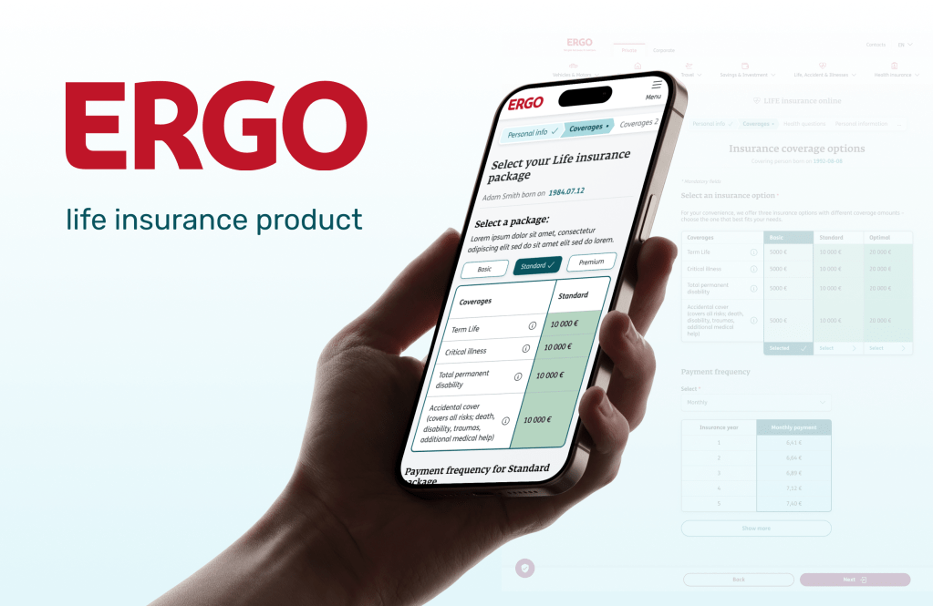
We introduced logically grouped insurance packages designed around common needs. This approach allowed users to evaluate clear options rather than constructing policies piece by piece. By reducing the cognitive load, users could make decisions faster and with greater confidence. The redesigned flow consists of a 9-step guided journey that helps users:
• explore insurance package options
• provide personal information
• complete the health questionnaire
• review their coverage
• confirm and purchase the policy
Once we finalized the flow, it was time to test it. The prototype enabled rapid iteration before implementation, ensuring the experience remained both compliant and understandable for users.
Key Design Principles
Reduce emotional friction: Life insurance touches sensitive topics. The interface uses calm language and clear structure to make the process feel manageable.
Build trust through transparency: Insurance decisions require confidence. The design avoids manipulative patterns such as pre-selecting insurance packages, even though this was initially suggested by marketing. Instead, users remain fully in control of their choices.
Guide users step by step: Because the process is traditionally explained by agents, the interface needed to replicate guidance digitally through microcopy, structure, and pacing.
The Outcome
The project successfully enabled ERGO’s first fully digital life insurance purchase flow. Customers can now buy life insurance entirely online, without visiting an office or speaking with an agent. Early feedback from ERGO headquarters was very positive, and the project is considered a successful step toward digitalizing a traditionally offline product. Performance metrics are currently being collected.
My Role
As Senior Product Designer, I:
• mapped out the pain points of the initial concept (already existing Puzzle concept) through user testing and interviews
• mapped the insurance system with the analyst
• designed the full purchase journey
• initiated the simplification of the health questionnaire
• facilitated alignment between legal, business, and product teams
• designed the final responsive interface
What I Learned
Designing for insurance required balancing user needs, emotional sensitivity, and strict regulation.
This project reinforced that good product design is often about translating complex systems into experiences people can actually understand. Understanding the user’s mental model and reducing the mismatch between how the user thinks the system works and how the system actually works is crucial to providing a meaningful experience.
Even highly regulated industries can deliver simple digital experiences when design bridges the gap between business, legal, and user needs.
